This post is courtesy of Displayr who have generously offered to sponsor a series of independently authored posts about interactive visualization with R and JavaScript. Thank you so much Displayr for this opportunity.crossposted at buildingwidgets and Medium
Before I start on the second post on the series, I wanted to make sure all my R readers knew that the charts in this post are created in R using htmltools. Also, each chart should have a link to reproducible code.
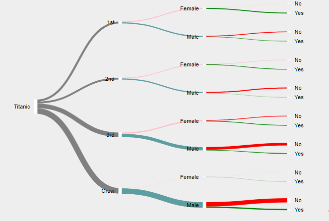
In our first attempt at improving hierarchical visualization, we combined d3.tree() with d3-sankey. Our sankeytree concoction allows us to convey size or flow from one level to the next while maintaining some sense of the tree, but the sankeytree still suffers from the universal constant node size (height and width).
We are left with extra wasted space that possibly distracts from the message of the visualization. In this post we will see if we can eliminate some of this space with d3.partition() assisted by d3.treemap(). Let’s call this one parttree.
d3.partition()
Partition, or icicle, visualizations fill space much like a diced treemap or side-by-side stacked bar chart. The visualizations are commonly used in debugging and programming optimization. In this context, they are called flame graphs.
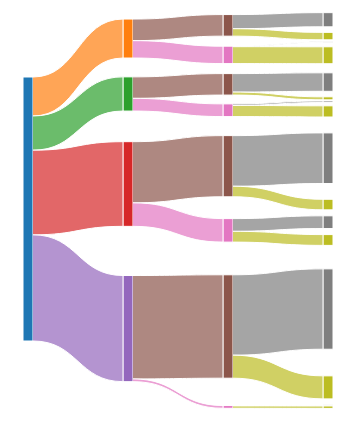
Since we are trying to eliminate some of the wasted space from our sankeytree, let’s see if we might be able to leverage the “space-filling” d3.partition(). For consistency, let’s continue to use the Titanic dataset from R and create a partition.
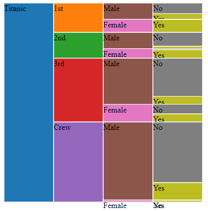
While d3.partition() efficiently fills the space, these charts in this context do not reveal the hierarchical nature of the underlying data as much as I would like. Also, in my opinion, the above chart is not very inviting or “fun”.
smaller Nodes with Links
What if we start with d3.partition() and then use a node size smaller than the partition-assigned size? Then, we might have some space to draw links like a d3.tree() or d3-sankey. Seeing is believing, so let’s make the suggested adjustment to the partitioned Titanic and then animate the transformation.
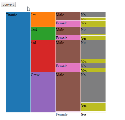
I consider this good progress, and our new parttree imparts a sense of hierarchy with an efficient and compact portrayal of size and flow. I should note that we sprinkled in some assistance from d3.stack() and d3.treemap(). However, the straight angled links might be a little rigid. This can be solved with help from d3.linkHorizontal.
Finishing Touches
A little curve in our links might be nice. However, just a line with width defined by stroke-width can limit us in ways we might discuss in future posts, so let’s define a path with four points to draw our link.
Just imagine if we add proper labels, good color, and interactivity.
Next
If we like our new creation, then next steps will be to create a more formal d3 layout and then build a reusable chart based on the layout. As mentioned in the post, drawing the links as a path with four points instead of a line with two points will allow us the ability to add even more encoding and information in our links. In the next post, we will explore what we can do with our new powers.